two days from call to launch
Planet Fitness needed a website. We finished it in two days. A clean, mobile-friendly site that loads fast.
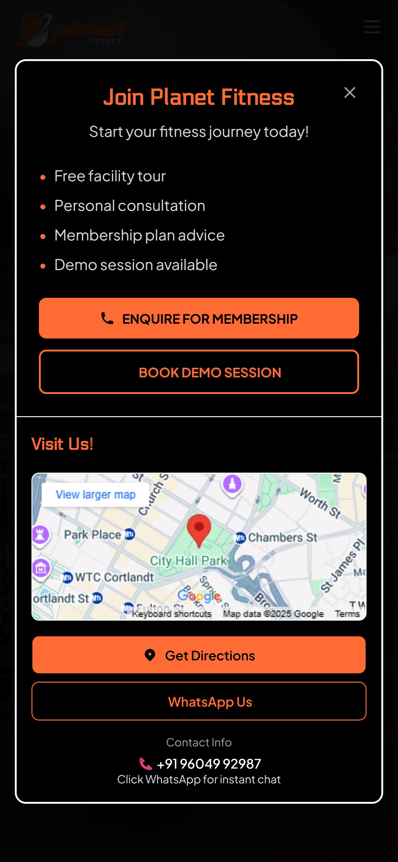
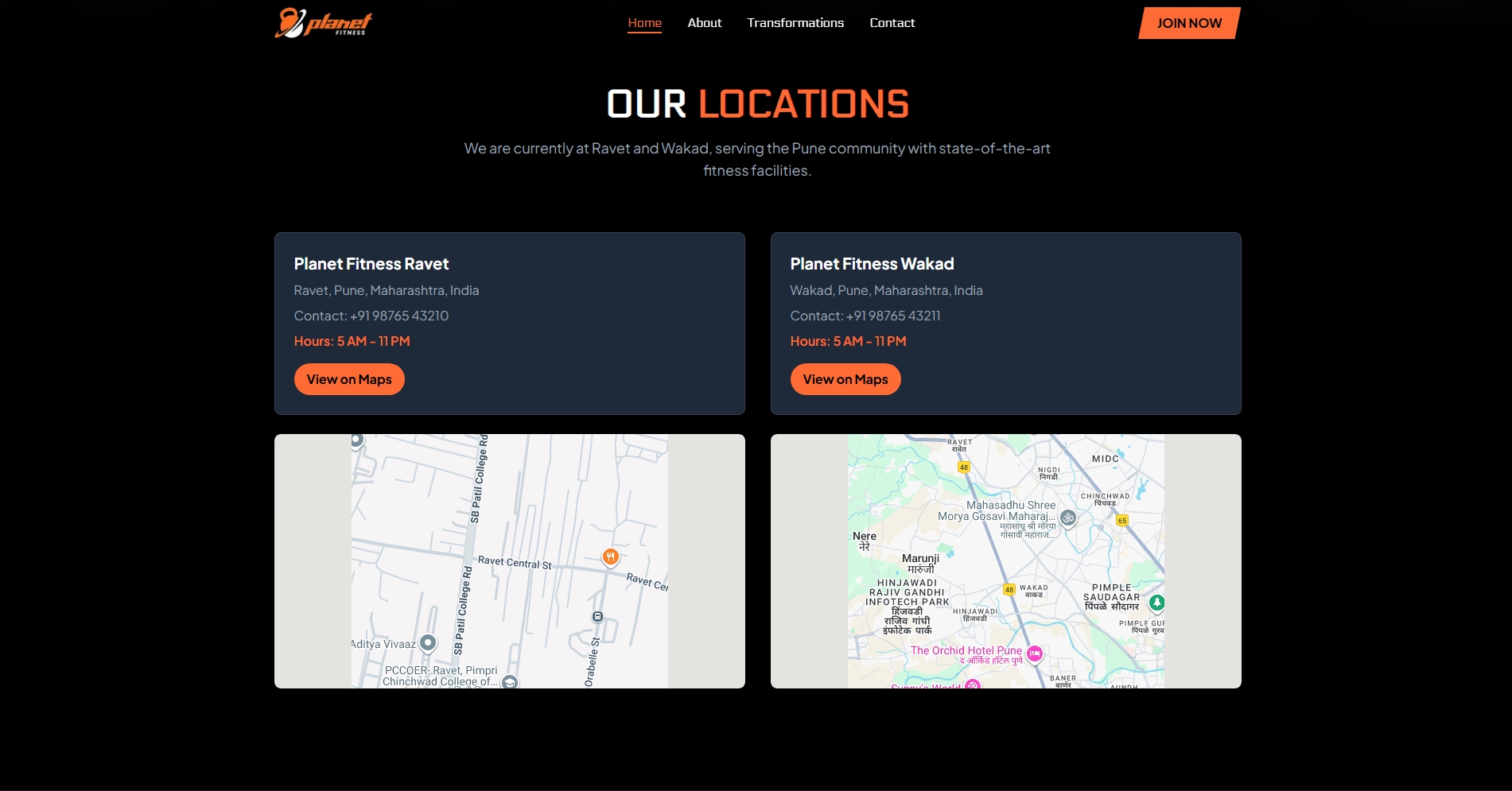
Planet Fitness needed a website. They had locations, contact info, testimonials, and a clear idea of what they wanted. No complicated features, no endless revision cycles. Just a straightforward site that looked good and worked.
We finished it in two days.
the first call
"We need a website. Simple. Fast. Clean."
"How fast?"
"Yesterday. But realistically? Two days."
"Send the brand kit. We're on it."
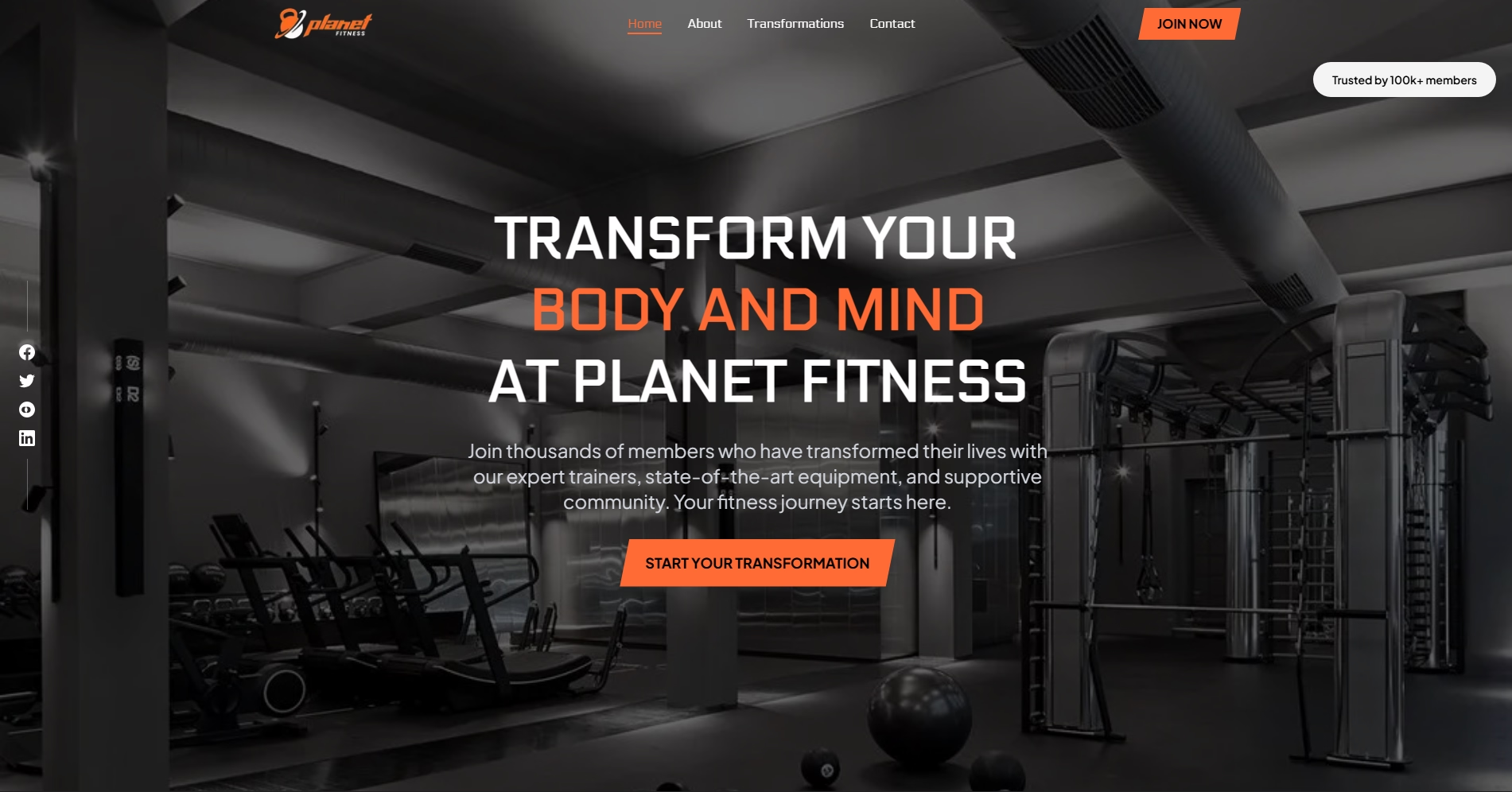
The logo was orange, white, and black. We matched those colors, went with a dark theme that made the gym feel premium without being intimidating, and laid out the pages: home, locations, contact form, testimonials.
execution speed
Here's the thing about simple projects: they're only simple if you don't overthink them. We didn't spend days debating color gradients or animation timing. We built what they needed—a clean, mobile-friendly site that loads fast and makes it easy to book a membership.
Day one: design and structure. Day two: content integration and testing. Launch.
why fast doesn't mean sloppy
The website looks professional because we focused on fundamentals. Readable fonts, clear hierarchy, obvious calls to action. The contact form works. The site loads in under two seconds. Every page is optimized for mobile because that's where most people browse.
Planet Fitness didn't need revolutionary. They needed functional and good-looking. We delivered both in forty-eight hours of work spread across two days.
the result
The client went from no online presence to a complete website in less than a week from first contact. No subscriptions for features they don't need, no ongoing maintenance for a site that does exactly what it's supposed to do.
Sometimes the best solution is the straightforward one, executed well and delivered fast.

"They delivered a complete, professional website in 48 hours. No subscriptions, just a straightforward site that works perfectly."