design that reassures
Interior design clients aren't browsing on a whim. The site needed to feel premium without feeling stuffy.

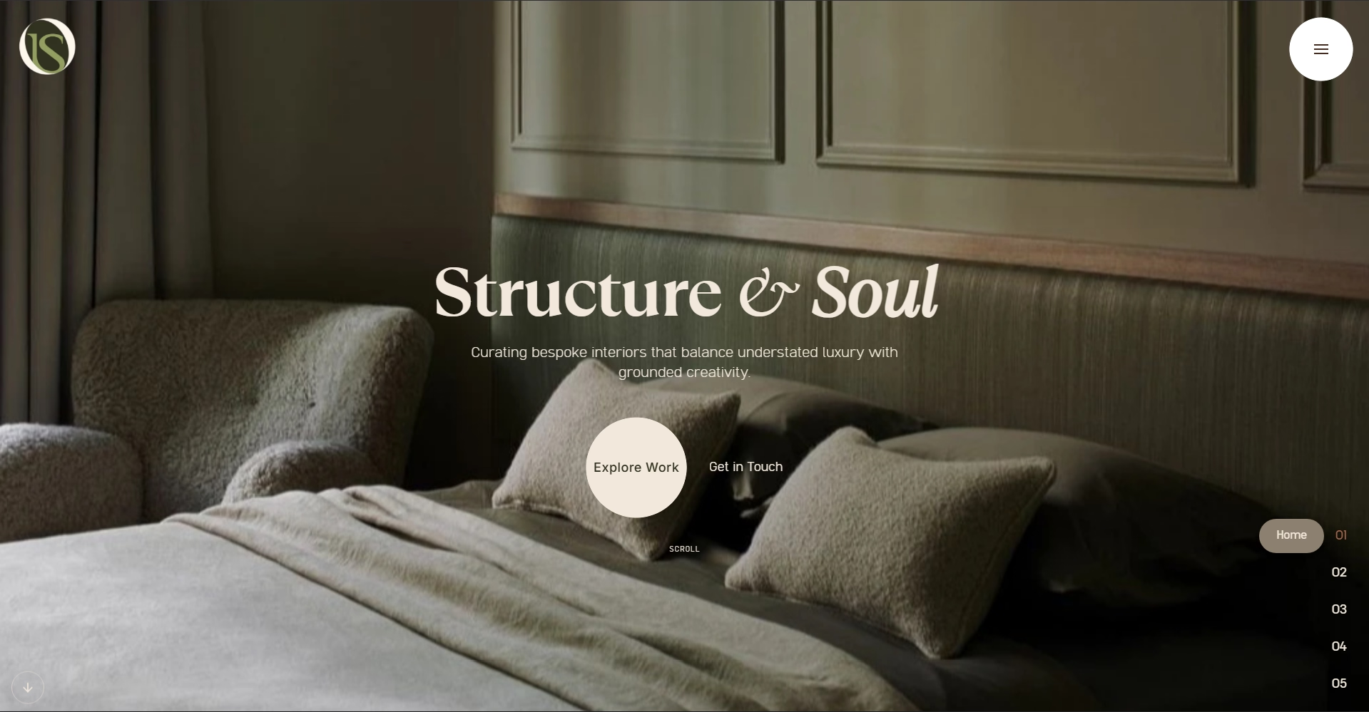
InchScale came to us with an interesting challenge. They're interior designers, which means their clients are already making high-stakes decisions about their spaces. The website needed to feel like an extension of that trust—polished, intentional, and confident.
the brief
"People judge our taste before they even call."
"So the site is the first test."
"Exactly. It can't just show the work. It has to feel like the work."
"Got it. Premium, intentional, and absolutely no clutter."
They provided their brand kit—colors, logo, typography. That gave us a foundation. Our job was to build something that felt both sophisticated and approachable.
studying the audience
Interior design clients aren't browsing on a whim. They're researching, comparing, looking for signals that a designer understands their aesthetic. So we focused on letting the work breathe. Clean layouts, intentional negative space, smooth transitions between projects.
The animations aren't there to show off. They're there to guide attention and create a rhythm as someone scrolls. Every element serves the purpose of making the visitor feel like InchScale knows what they're doing—because they do.
the design philosophy
We kept it minimal. Large images, simple navigation, text that doesn't compete with the visuals. The site is built around the work itself, not around clever tricks or unnecessary complexity.
For InchScale's clients, the website needed to feel premium without feeling stuffy. Modern without being trendy. That balance came from understanding who was visiting and what they cared about.
impact
The site went live as a static build—no ongoing subscriptions, no complicated CMS they'd need to learn. It does one thing extremely well: it makes InchScale look exactly as professional as they are.
Since launch, their consultation bookings increased. Not because of some marketing trick, but because the website accurately represents the quality of work people can expect.

"A beautifully designed showcase for my interior projects. Exactly what I needed."